
Why Your Website Must Be Designed Mobile-First

Today, when the majority of global online traffic comes from mobile devices, designing a website only with desktop in mind is no longer enough.
Most users visit your website for the first time on their phone, and this first impression directly determines whether they stay or leave.
Mobile-First design is not a trend anymore — it is a mandatory standard that defines your website’s quality, performance, and competitiveness.
1️⃣ Most Users Visit Websites on Mobile
The numbers speak for themselves:
-
Over 70% of web traffic worldwide comes from mobile devices
-
More than half of e-commerce purchases are made on mobile
-
Almost every user checks a website on mobile before desktop
If your website performs poorly on mobile, you lose users within the first 3 seconds.
Mobile-First = building for users where they actually are.
2️⃣ Google Uses Mobile-First Indexing — Your SEO Depends on It
Google now ranks websites based on their mobile version, not the desktop version.
This means:
-
Your SEO performance depends directly on mobile UX
-
Poor mobile experience = poor rankings
-
Fast, optimized mobile pages boost your visibility and organic traffic
A Mobile-First design is fundamentally an SEO strategy.
3️⃣ Faster, Cleaner, More Efficient UX
Mobile-First forces designers and developers to focus on:
✔ speed
✔ simplicity
✔ clean layouts
✔ intuitive user flows
Desktop-First websites often become cluttered and collapse visually on mobile.
Mobile-First websites, however, start with a clear, highly optimized layout that then scales naturally to desktop.
The result is a visually clean, intuitive, and comfortable experience for every user.
4️⃣ Better User Experience — Simple, Clear, and Easy to Navigate
Mobile-First websites offer:
-
large, readable buttons
-
simple, fast navigation
-
clear CTAs
-
optimized one-hand usage
-
reduced cognitive load
This creates a smoother user journey, increases time spent on the site, and improves conversions.
5️⃣ Higher Conversions — Mobile Users Act Fast
Mobile users make decisions quickly.
If your mobile version is smooth and optimized, you get:
📈 more inquiries
📈 more calls
📈 more form submissions
📈 more purchases
A well-designed mobile UX directly boosts your business results.
Conclusion
Mobile-First design is not just a design choice —
it is a business decision that ensures:
✔ a stronger first impression
✔ higher SEO rankings
✔ a better user experience
✔ faster page loads
✔ higher conversions
Websites built Mobile-First always outperform those designed primarily for desktop.
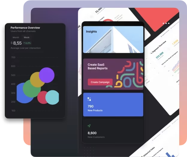
Insights Consulting — Your Partner in Modern Web Design
At Insights Consulting, we build websites based on the Mobile-First principle, following modern UI/UX standards.
We create websites that are:
-
fast and technically optimized
-
visually modern and clean
-
conversion-focused
-
tailored to your business goals
If you want a website that creates the right impression from the very first second —
contact us and let’s build the digital presence your business deserves.
More Articles
Show All Articles →
How We Built a CRM for a UK Construction Company (Case Study)
Custom CRM for a UK construction company: streamline leads, quotes, orders, and finances with a system built for real wo...

Common Mistakes Georgian Companies Make When Hiring Developers
Common mistakes Georgian companies make when hiring developers and how to avoid costly software failures.

What Does a Well-Structured Digital Infrastructure Look Like in a Business?
Learn what a well-structured digital infrastructure looks like and how connected systems, automation, and data flow impr...